Magazine Spread
Magazine Spread
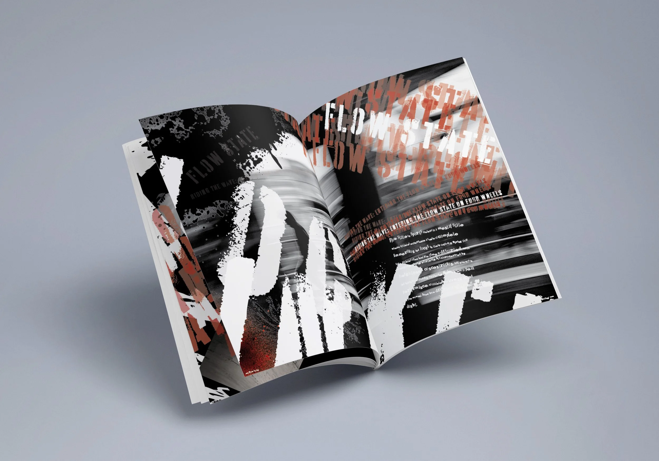
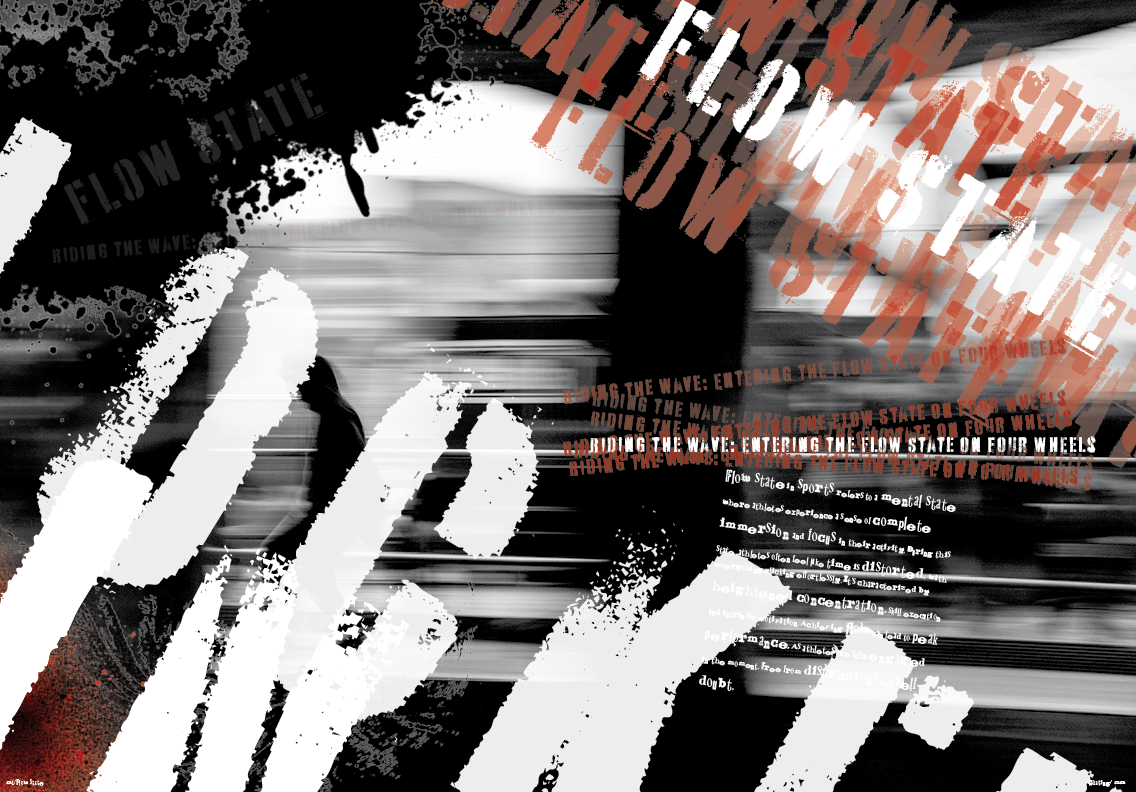
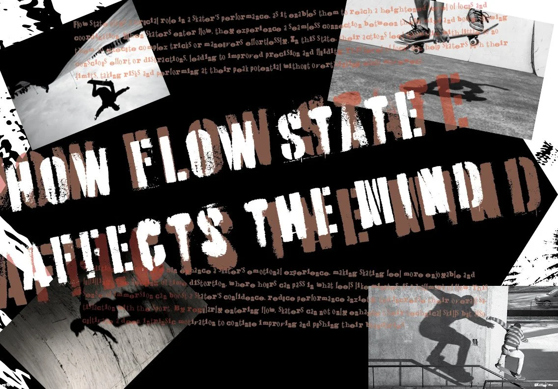
This magazine was a skateboarding design that mimics David Carlson’s style. This four-page magazine covers flow state and how this state affects skateboarders. The typeface is meant to give off a scuffed or older look to the magazine. The repeated words behind the subtitle are supposed to make everything seem out of focus while the white title pops out. While the imagery in the back is supposed to represent a flow state.
Designs
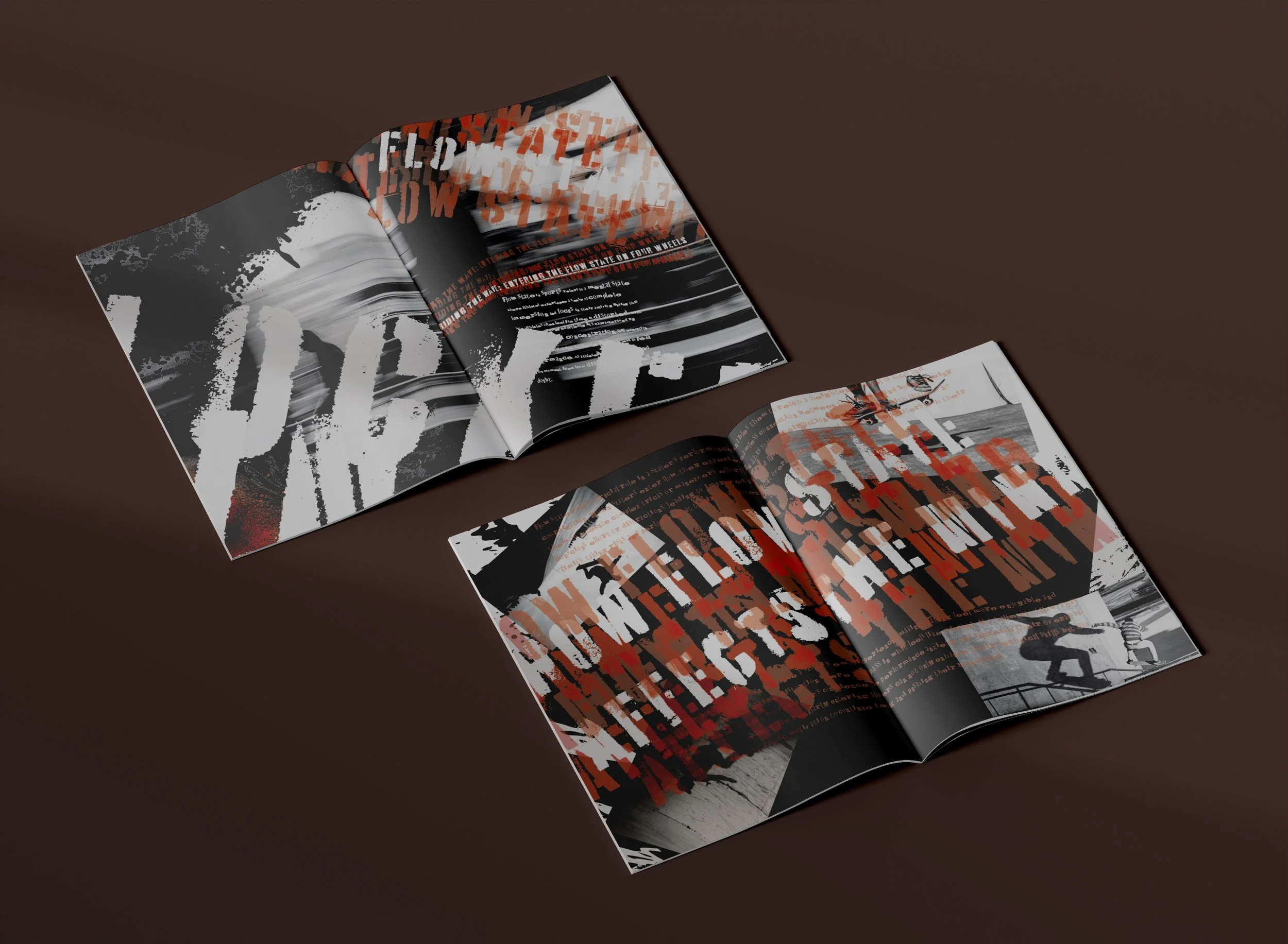
Pages 1 + 2
Pages 3 + 4
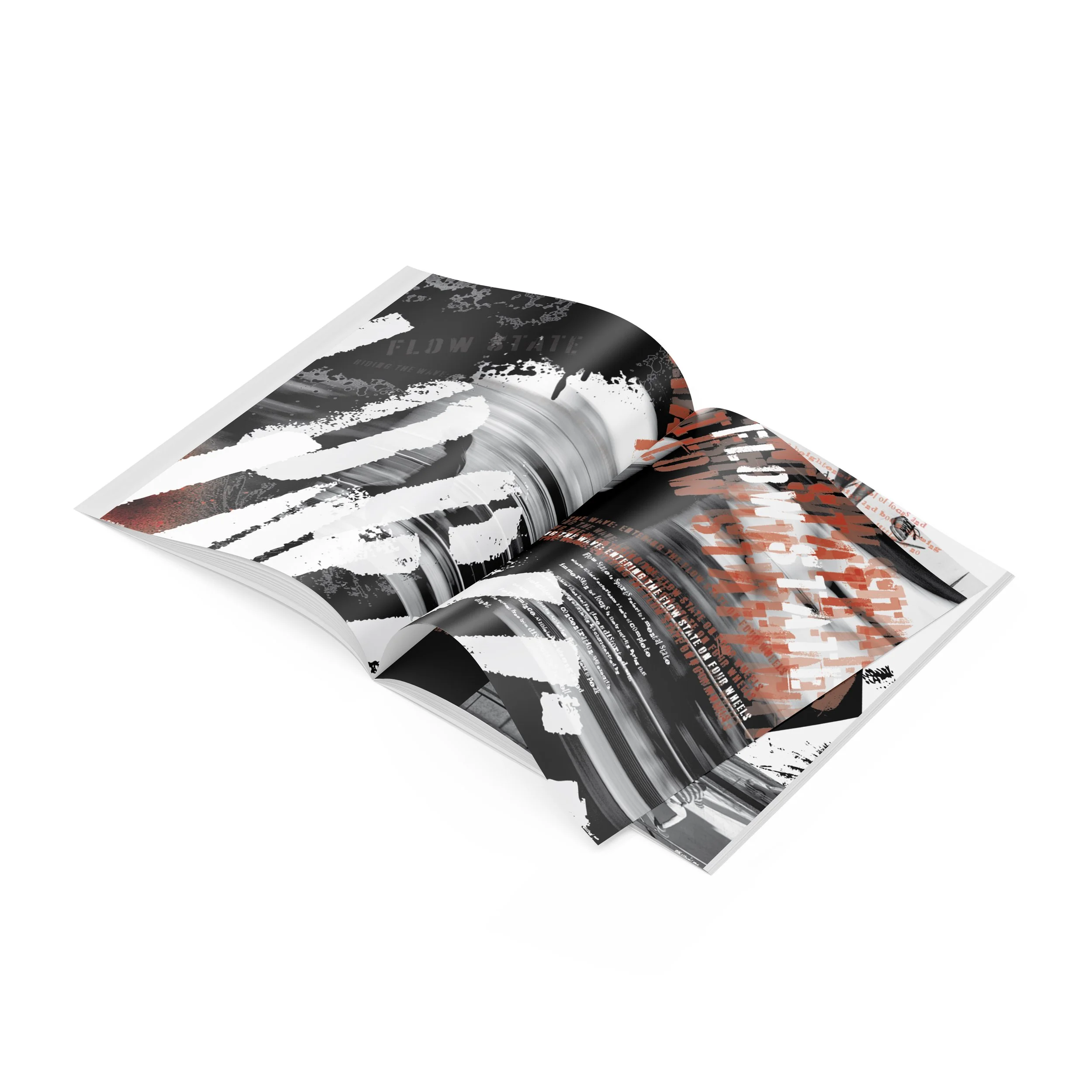
Mockups